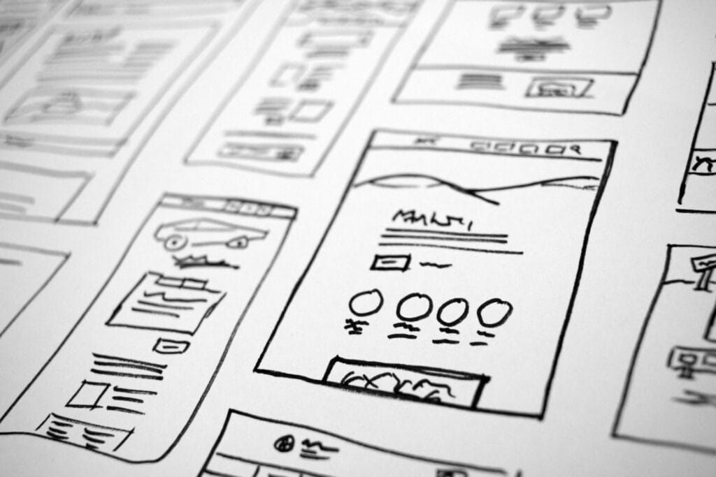
People assume “premium” means sleek gold gradients or fancy fonts.
No.
A brand feels expensive because every detail feels thought-through.
Here’s what actually creates that high-end vibe:
1. Generous spacing
Cheap sites cram everything together.
Premium sites let content breathe.
2. Cohesive typography
Two good fonts beat six random ones.
And font weight hierarchy does more than people realize.
3. Clean color system
Premium brands use:
• 1 primary color
• 1 accent
• neutrals as the foundation
That’s it.
4. Purposeful animations
Smooth fades, micro-interactions, button hovers.
Not bouncy clutter.
5. Photography that matches the brand
Even one inconsistent image can break the whole aesthetic.
6. Consistency across ALL pages
The entire site should feel like it was designed in one sitting by one brain —
not six different freelancers on Fiverr.
When everything aligns, your brand immediately feels elevated —
long before anyone reads a word.