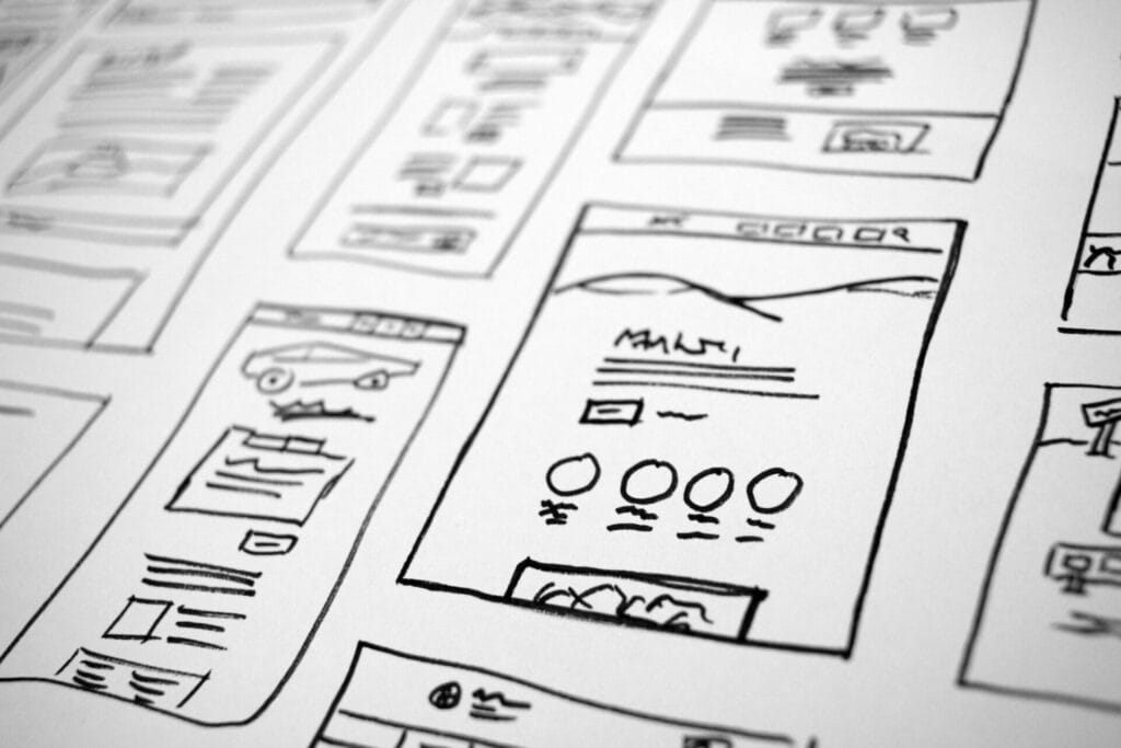
If we’re being brutally honest, most small business websites don’t “need a redesign”…
they need to restart from scratch.
Half of them look like they were built during the dinosaur era, the other half scream “my cousin made this in class.” And yet business owners wonder why nobody fills out their contact form.
Here’s the truth:
A website is basically your digital salesperson — and most businesses have theirs showing up late, dressed wrong, and mumbling at customers.
So here’s what actually makes a site crush it:
1. Clarity beats everything.
Visitors should know:
✔ What you sell
✔ Who it’s for
✔ What to do next
within 3 seconds.
If your hero section doesn’t pass that test, it’s already leaking money.
2. Mobile isn’t optional anymore.
More than half your traffic is on a phone — but most sites still look like a desktop squeezed through a pasta machine.
Buttons too small, text too cramped, forms impossible to use.
A mobile-first layout doesn’t mean “shrinking stuff.”
It means designing for thumbs, not mice.
3. Modern credibility signals matter.
People look for:
• clean layout
• fast loading
• consistent spacing
• modern typography
• strong CTAs
When your site LOOKS trustworthy, conversions go up before you even touch the copy.
4. The homepage needs one job: sell the next step.
Not 20 steps. Not a life story.
Just the next step.
Read more. Book a call. Explore a service.
Anything beyond that = noise.
The takeaway:
If your website isn’t actively helping your business grow, it’s not “fine.”
It’s losing you leads every day.
And fixing it isn’t about making things prettier —
it’s about making the digital version of your business actually work.